Zovq supermarket chain
Brand identity
- Client
- Zovq supermarket chain
- Industry
- Retail and fashion
- Services
- Brand concept, Logo, Identity design
- Location
- Armenia
- Year
- 2022
Freshness on the shelves, freshness in the brand
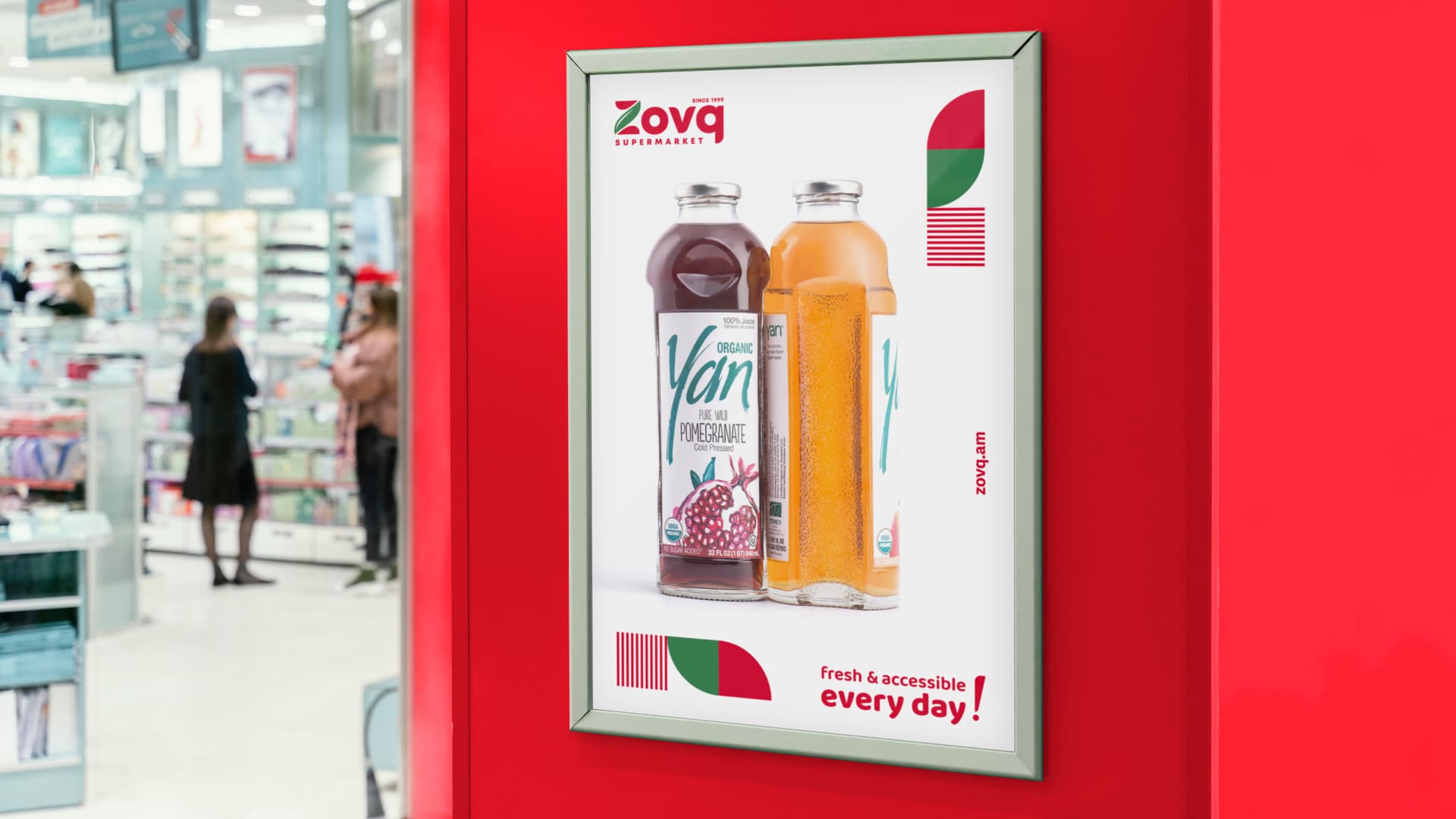
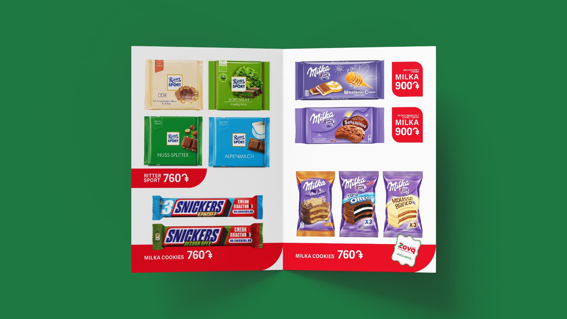
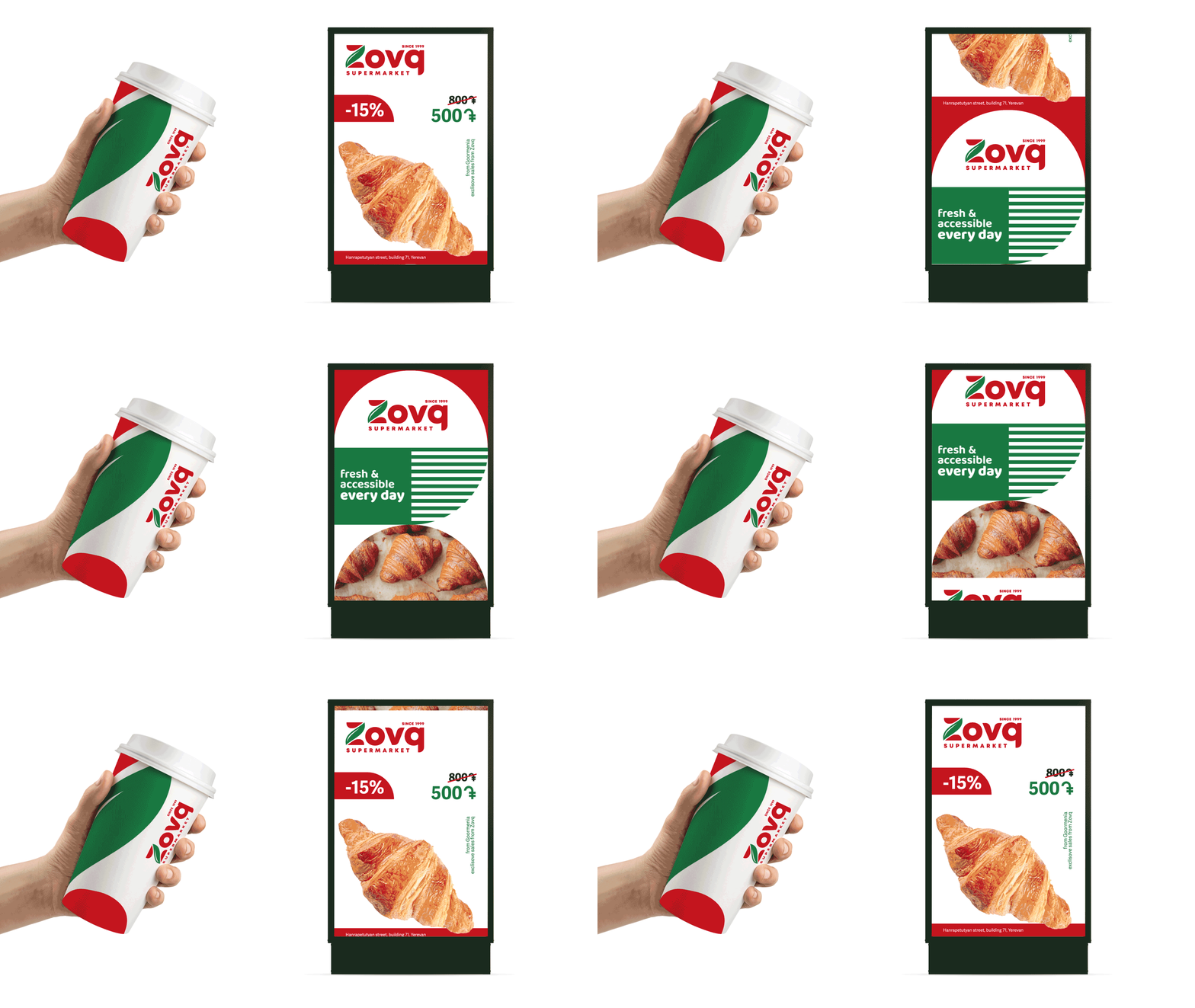
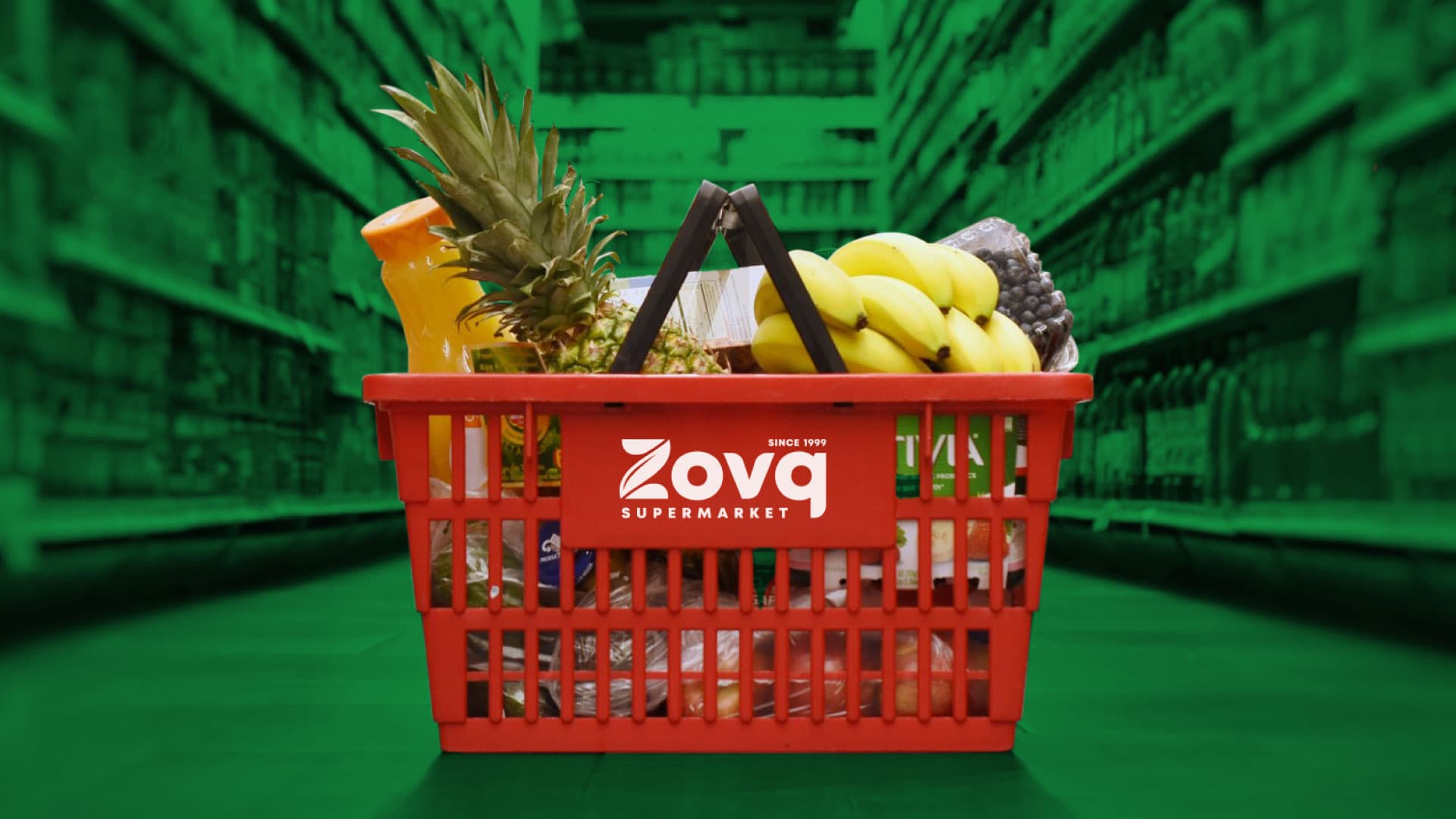
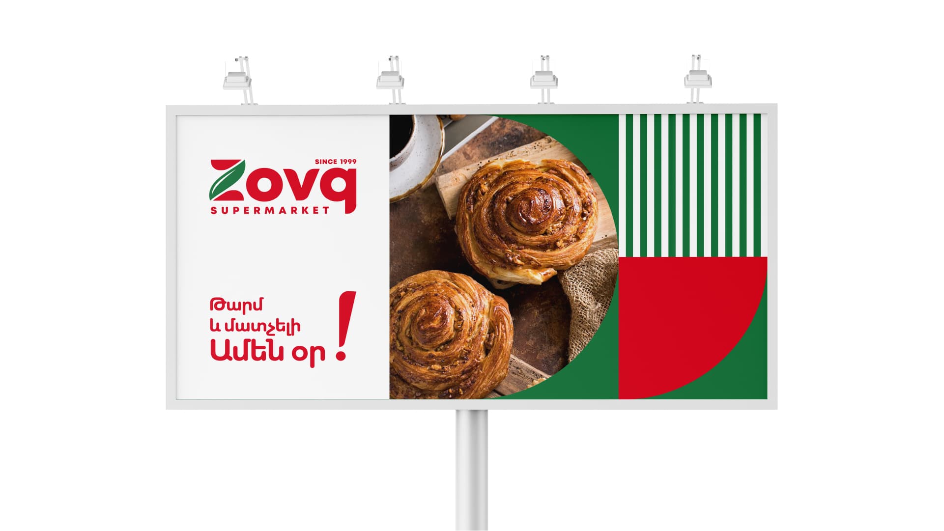
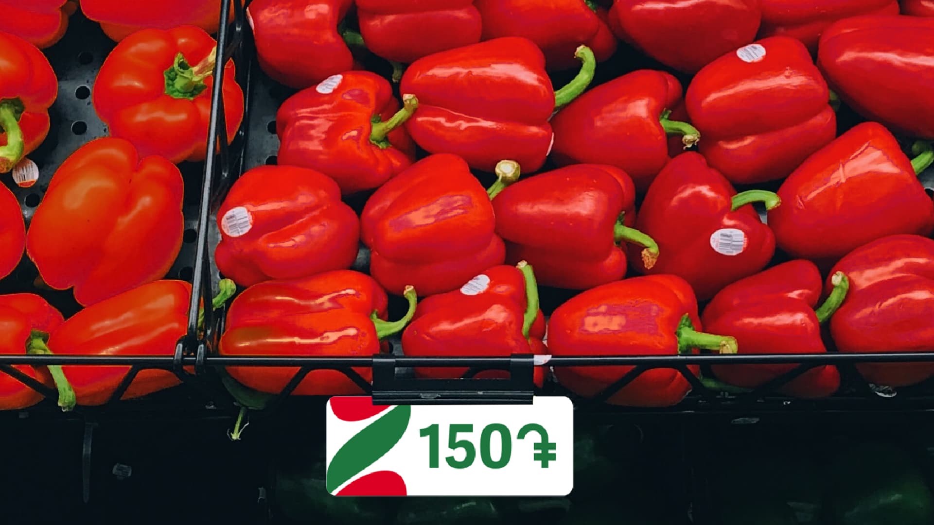
Nor Zovq is one of the largest supermarket chains in Armenia. The company operates withing the principle of "Everyday Low Prices", thus the branding was according to it. The customers of the chain are middle income individuals and families, usually shopping for a week. Meanwhile, the company has baker on spot. For over 10 years, the supermarket chain had the same branding. Within the frameworks of Braind and Nor Zovq cooperation a new, fresh brand was developed, still sustaining the feeling of being affordable.
Logo description
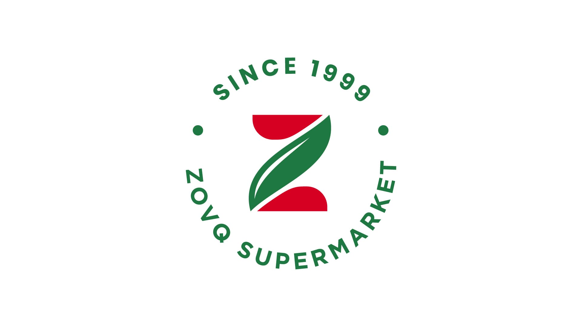
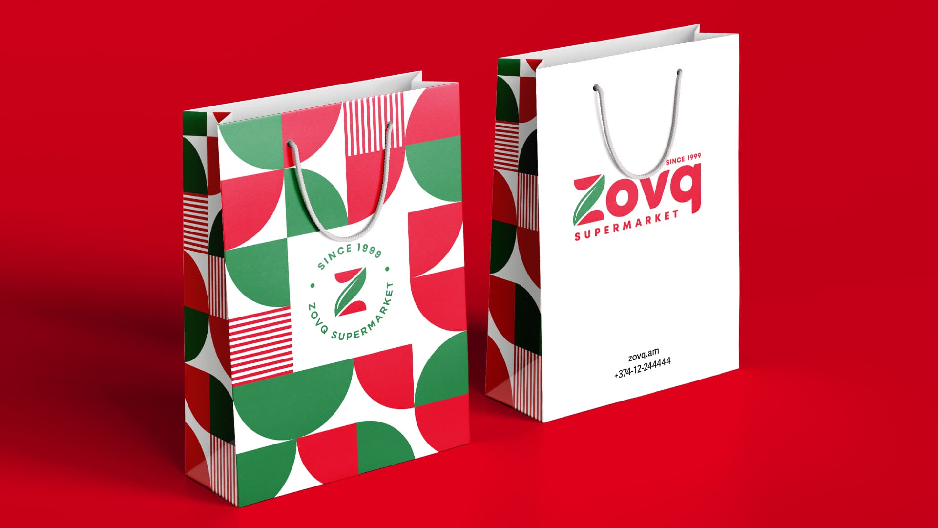
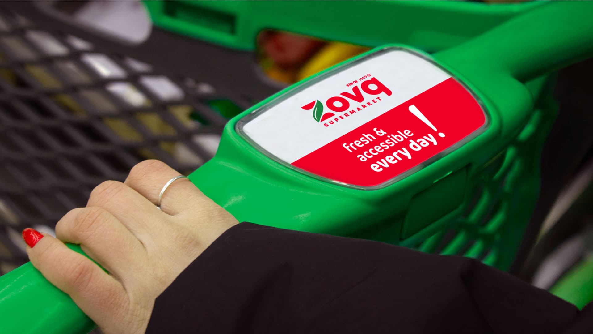
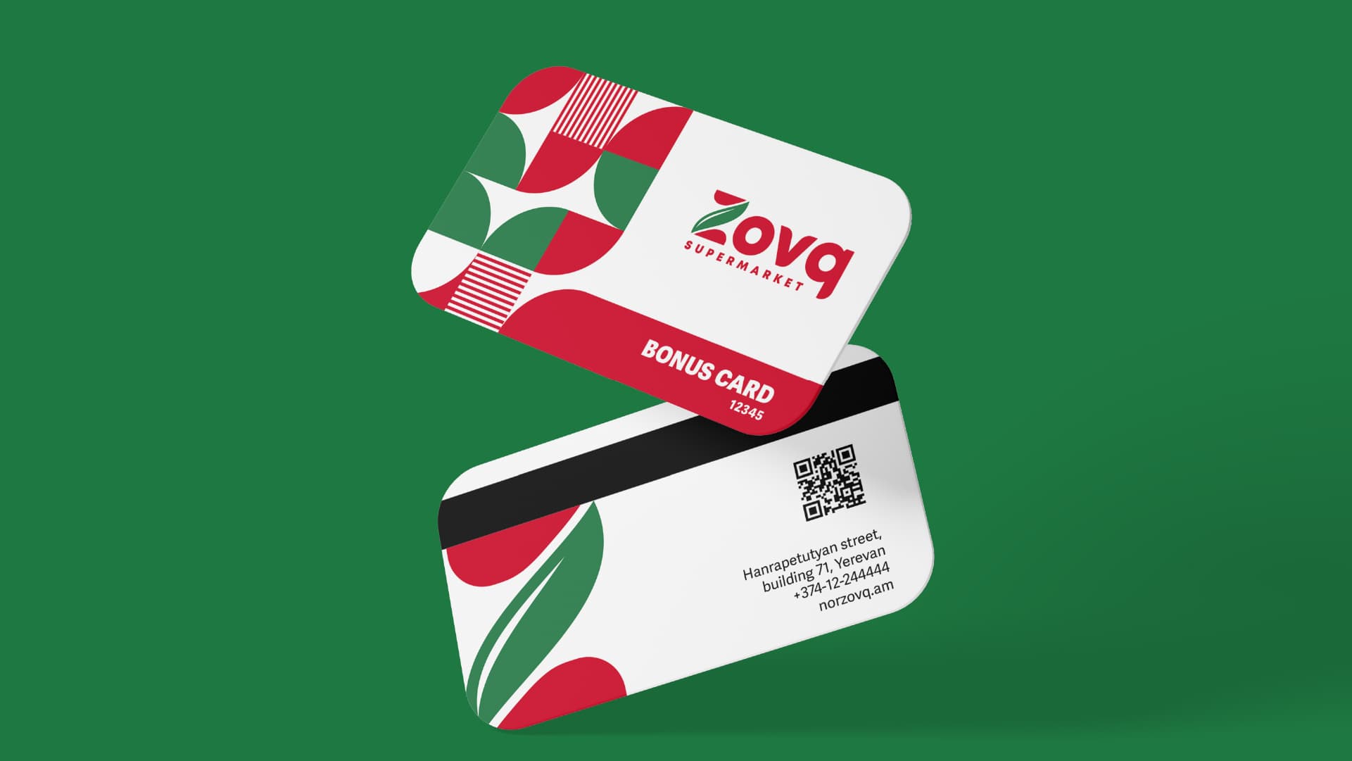
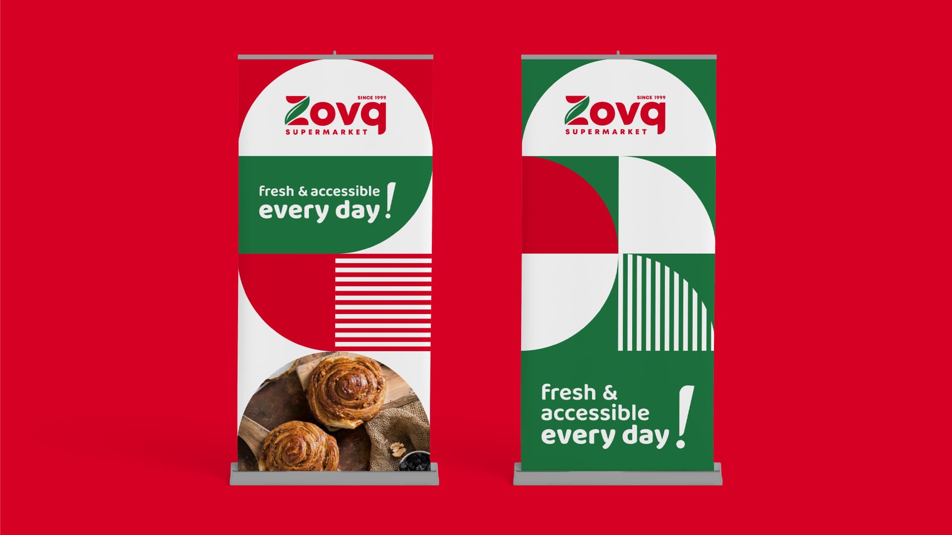
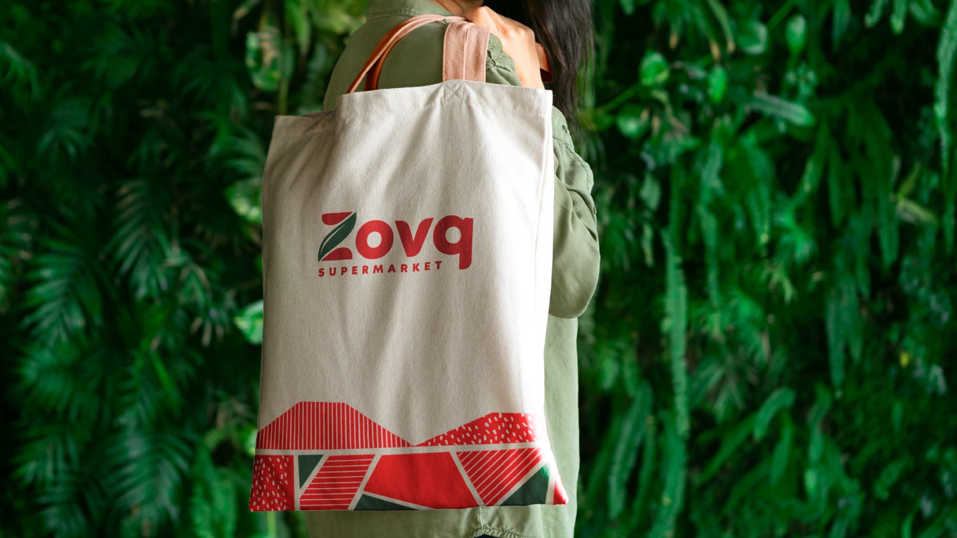
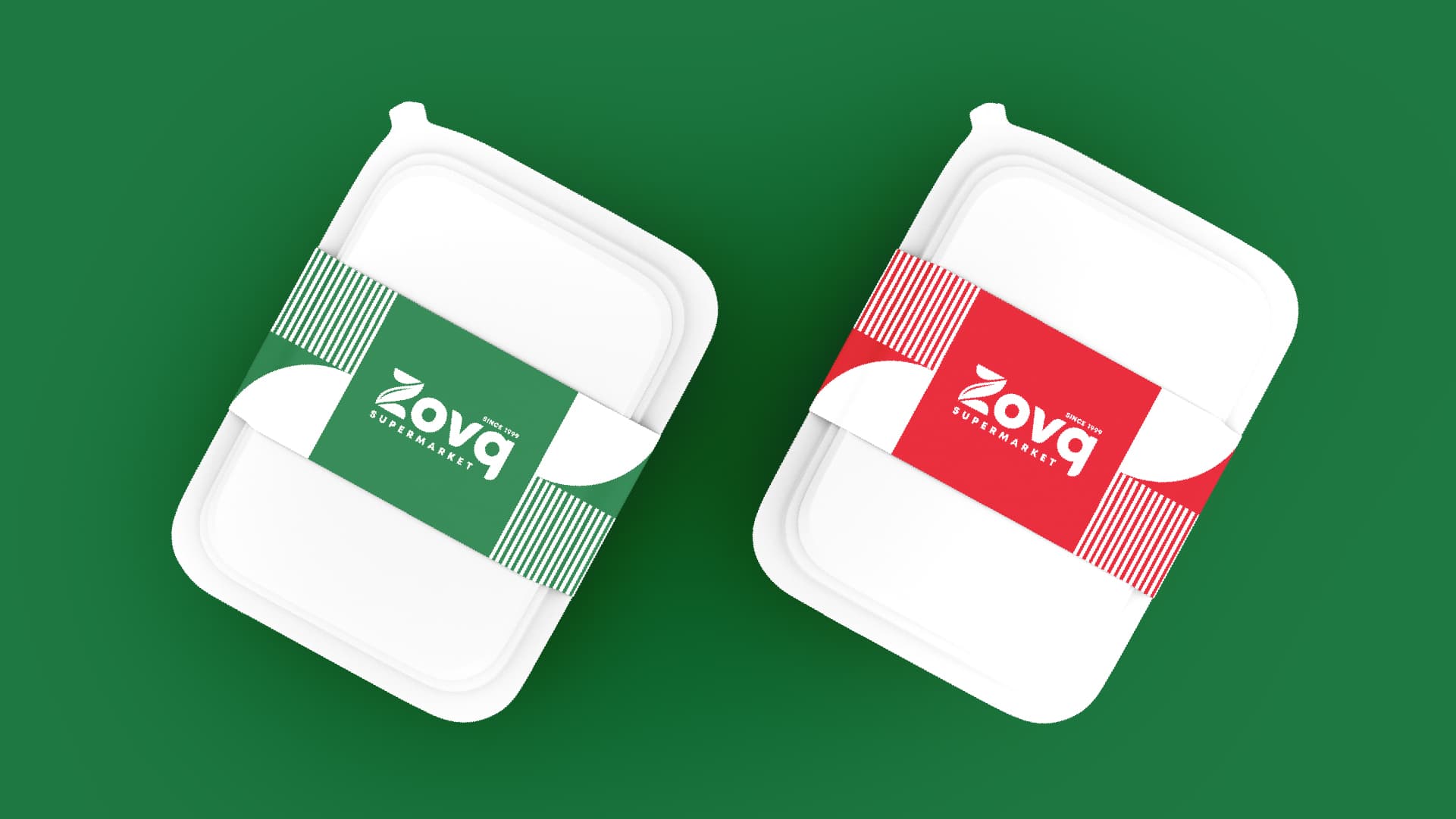
The logo is the graphically stylized Latin letter "Z" where the middle part imitates a green leave symbolizing freshness. The logo gets circle form as from the upper side there is a "Since 1999" and from the bottom "Zovq Supermarket" writings exist. The color palette of bright green and simple red combination is most used for EDLP-type supermarkets